…the mobile version of my portfolio is completely broken ■■


Sorry! This portfolio is still a work in progress. I want it to be really good, and it takes a lot of time so not all parts are completed yet, including the mobile design.

You're free to close this modal to preview the website as it is, but please, if you're interested view on your desktop device. Thanks!
integrating AI into the product/

These days, everyone’s talking about AI, maybe even a bit too much. But imagine this – in the distant year of 2022, hardly anyone knew what it really was. My task was to solve that gap and find ways to integrate this emerging technology seamlessly into the product as Brainly began its shift toward becoming an AI-first company.

years/

2022-24

responsibilities/

Leading UI and UX design of the AI integrations, as well as pure visual and motion design.

tags/
AI
Illustration
UI Design
Prototyping
User Research
Motion Design
Animation

the problem/

putting a square peg into a square'ish hole

Even in its early days (circa 2022), AI posed a major threat to Brainly’s core value proposition — providing quick answers to school and college homework. Sometimes, it's best to just fight fire with fire. Brainly's product strategy gradually shifted toward integrating AI into an existing and well-functioning product. Despite being an edtech platform, a seemingly natural fit for gen-AI, the transition still came with plenty of unknowns and challenges.
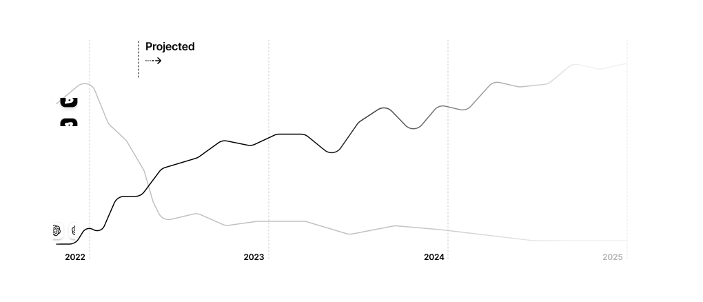

As ChatGPT’s popularity soared, Brainly’s numbers fell. Hard. Even the most basic gen-AI chats began to make Brainly’s core offering increasingly obsolete.
See full project -> 
As weird as it may seem these days, testing revealed that Brainly users don't really get how AI works. Even if they had some basic familiarity with the technology, the in-product integrations were often confusing — 'Uh… what do you mean you can just personalize an answer? How?'
See full project -> 
See full project -> 
The entire in-product communication, including any critical paywalls or promo materials, was based on the existing feature set. As AI became integral to Brainly's value proposition, all of the messaging and visuals had to be completely revised.

the process/

a technical, strategic, and creative challenge

At the time, Brainly only supported a (pretty basic by today’s standards) Math Solver feature, now the AI integrations would be far more broad and appear throughout web and mobile platforms. The challenges were multifaceted: from tackling complex technical implementation and defining monetization models, to simply just communicating the tech without confusing users.

1

understanding context(s)/
I'd consider this an absolute must in any design process but it was particularly important for this initative. There were several different contexts to comprehend before even tackling anything UX, like strategic reasons or technical limitations.

2

scoping and strategizing/
‍AI-integration is particularly demanding on a technical level. Could we do things we only dreamed of before? Technically, yes. But technically technically, there were a lot of strings attached to consider. All ideas needed to be closely analyzed through the lens of impact and effort.

3

designing and refining/
As AI was a novel tech at the time, there were simply a lot of unknowns before the actual implementation started. In practice, most design concepts had to be perfected and adjusted well into their development.
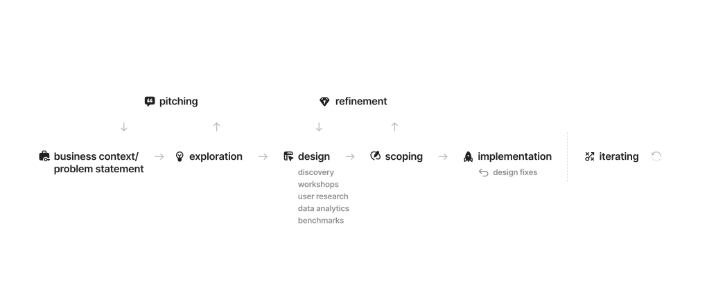
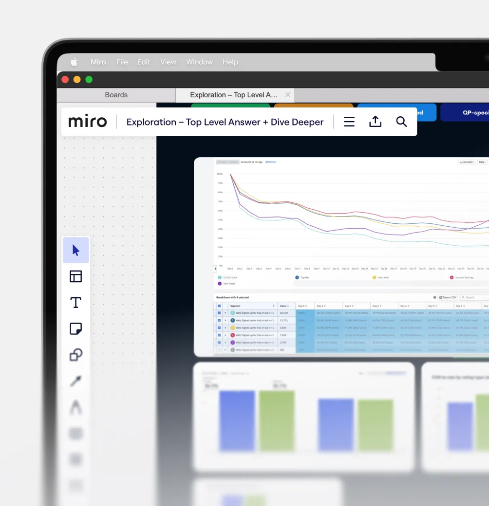
Unlike most projects at Brainly, this entire initative began without clearly defined goals or priorities (aside from a general “improve the product” objective). Since AI was still a novel and rapidly evolving technology at the time, the objectives of each implementation were largely mine to define, shape, and pitch to stakeholders.
See full project -> 
In growth design, you have to be on first name basis with quantitative data. I taught myself the basics of analytics and frequently used Amplitude to research best performers, spot correlations, experiment outcomes, etc.
See full project -> 
See full project -> 
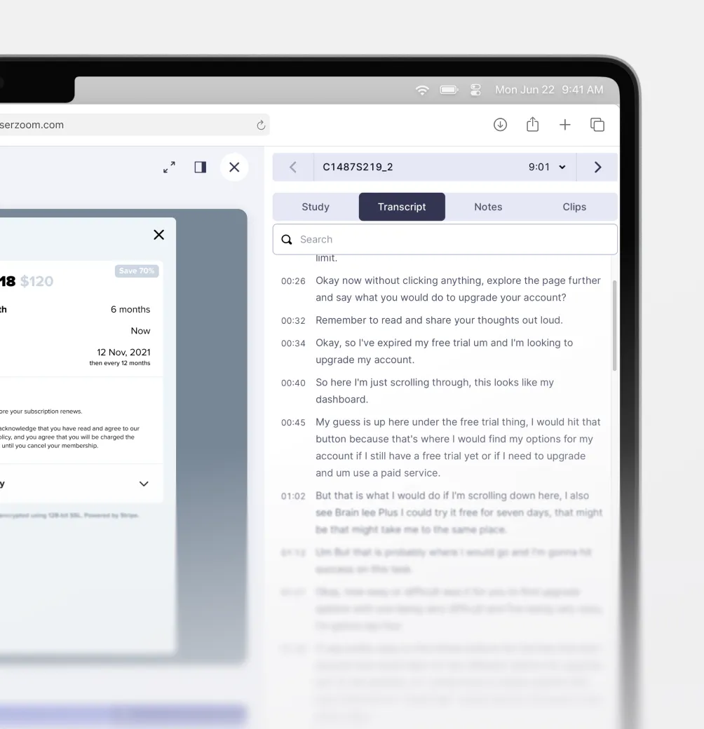
While not as flashy, I consider qualitative insights just as important as number data. I led and analyzed test sesions to understand how people actually interact with my designs and to support quantitative findings with real user insights.
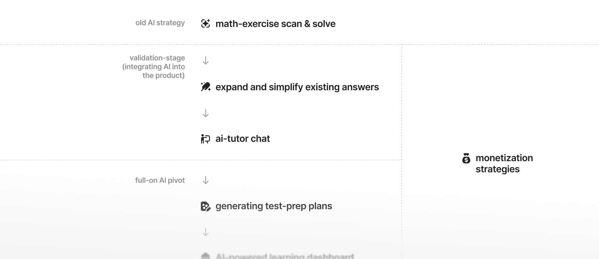
Before the AI boom of 2022–23, Brainly already offered basic AI functionality — the ability to scan and solve math problems. However, as the product strategy evolved, new features were introduced and tested with users to define the actual direction of the AI integrations. In practice, this meant extensive experimentation to determine not only how these features should be integrated into the product, but also how they should be monetized and communicated.
See full project -> 
See full project -> 
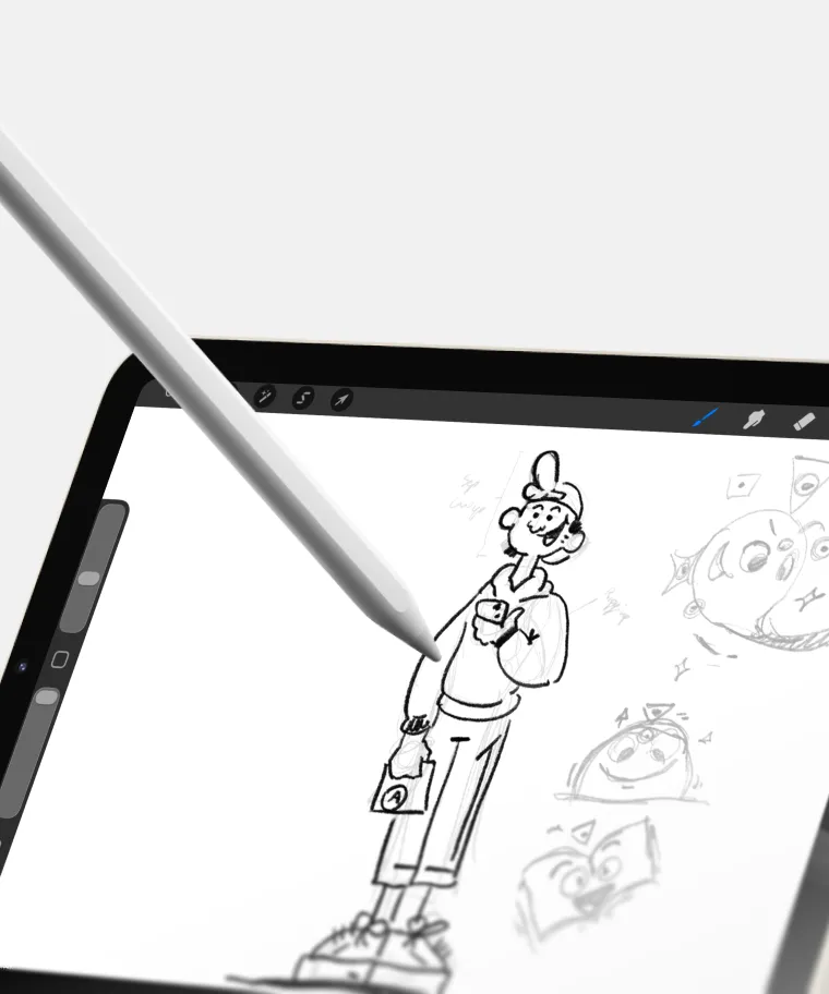
The shift in product strategy meant most existing visuals had to be reimagined from scratch. I could flex my creative muscle and come up with tons of illustrations, icons, and visualizations to represent Brainly’s new refreshed value proposition.
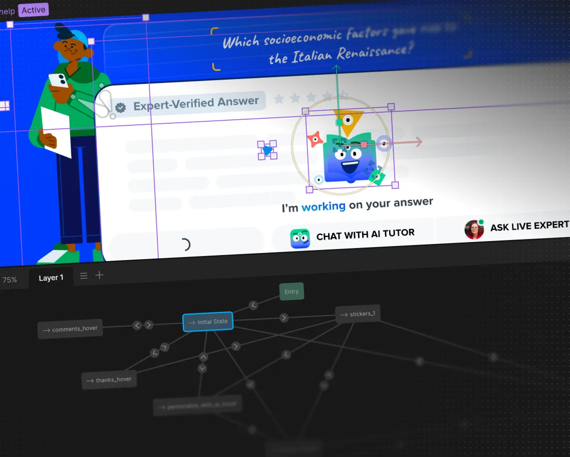
Redoing the entire in-app visual communication of the value proposition was a great opportunity to explore new tech—Rive made it possible to implement engaging animated assets users could actually interact with.
See full project -> 

the results/

iterations snowballing into a full pivot

Continuous work on the product’s key growth areas led to outstanding improvements across all major performance metrics, simultaneously improving the visuals and without relying on cheap monetization tricks. Larger projects I led helped unify previously disjointed, clunky parts of the product. My growth efforts often overlapped with other initiatives, contributing to better overall UX, enhancements to the design system (PENCIL), and various technical improvements.
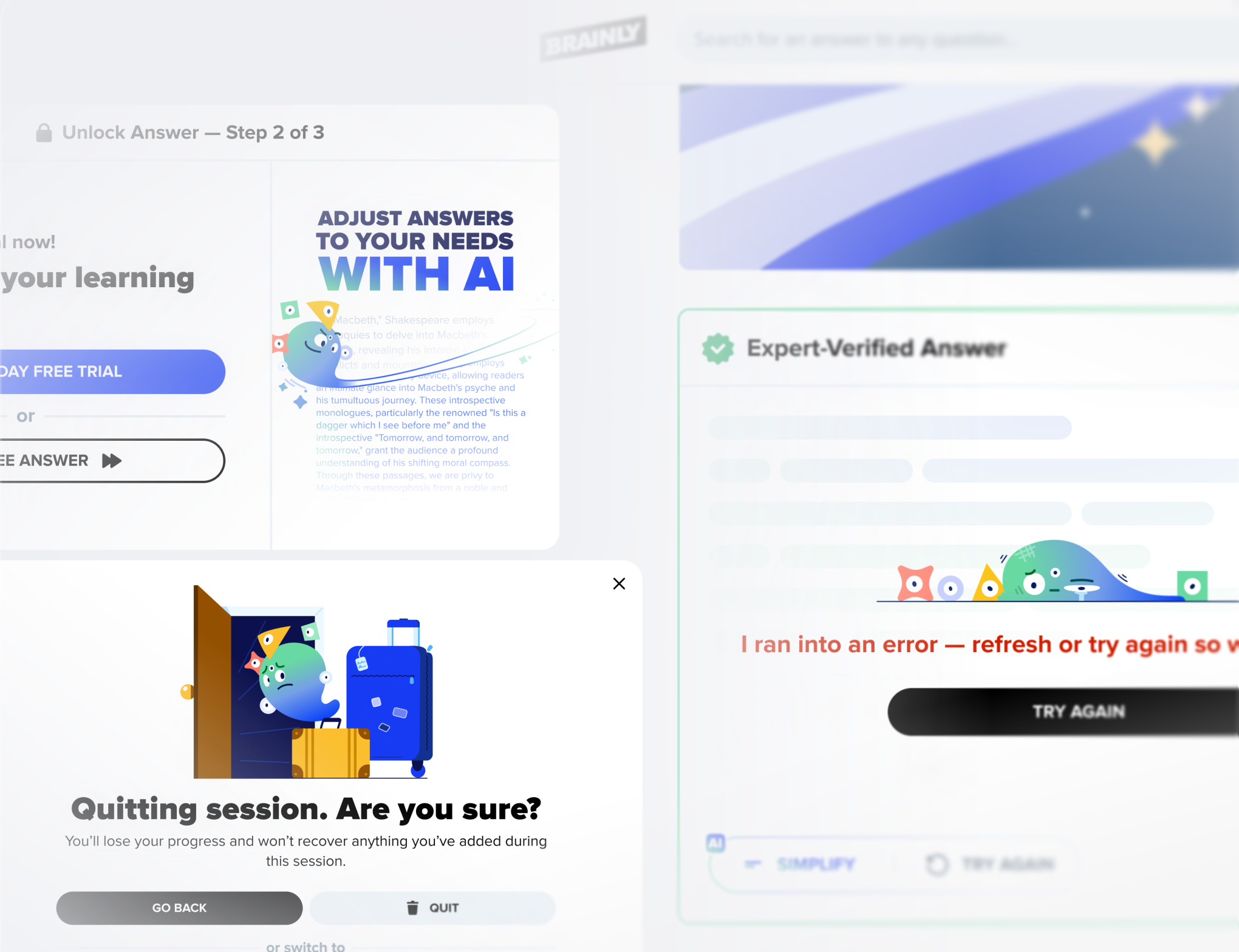
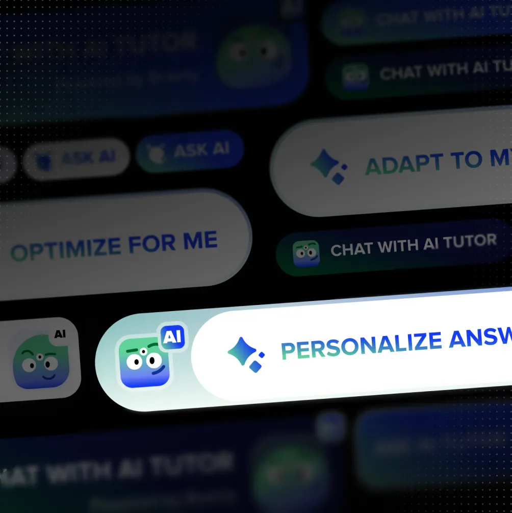
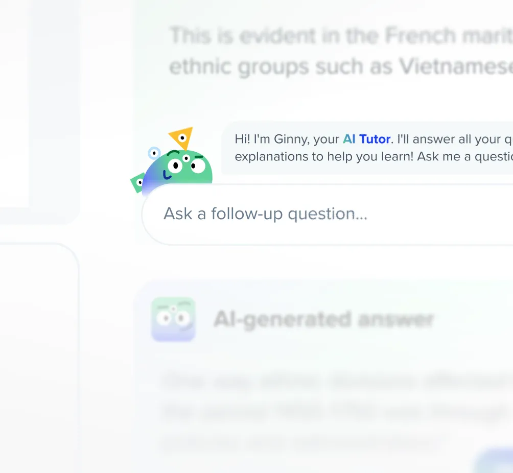
While I didn’t come up with the AI-mascot-character of Ginny, I did craft several illustrations and animations that integrated it into the product. Giving the AI more personality through these visuals played a key role in helping users understand and adopt the feature.
See full project -> 
Initially, many users didn’t have familiarity gen-AI. The UI had to feature many unintrusive context clues and visualizations to help them understand the inner-workings of this technology.
See full project -> 
The full pivot to an AI-first value proposition opened new, previously impossible avenues for growth. I led the design of an AI Tutor browser extension/website plugin that helped users break down complex concepts into simpler, clearer explanations, personalized to their individual needs.
See full project -> 
See full project -> 
As AI was still novel in 2022-23, most users were not familiar with the inner-workings of the technology. Testing and experiments revealed what visual treatment and copywriting would be best at clearly communciating these features to users.
First impressions are important. Using insights from user testing and analytics, I redesigned Brainly’s landing page to position it as an AI-first edtech platform. I created visuals, animations, illustrations, and interactive UI elements that quickly and clearly communicated this new product direction.
See full project -> 
See full project -> 
Rive became a key tool for communicating AI-powered features to users unfamiliar with the technology. I created a series of interactive animations that showcased these features in a natural and easy-to-understand way.
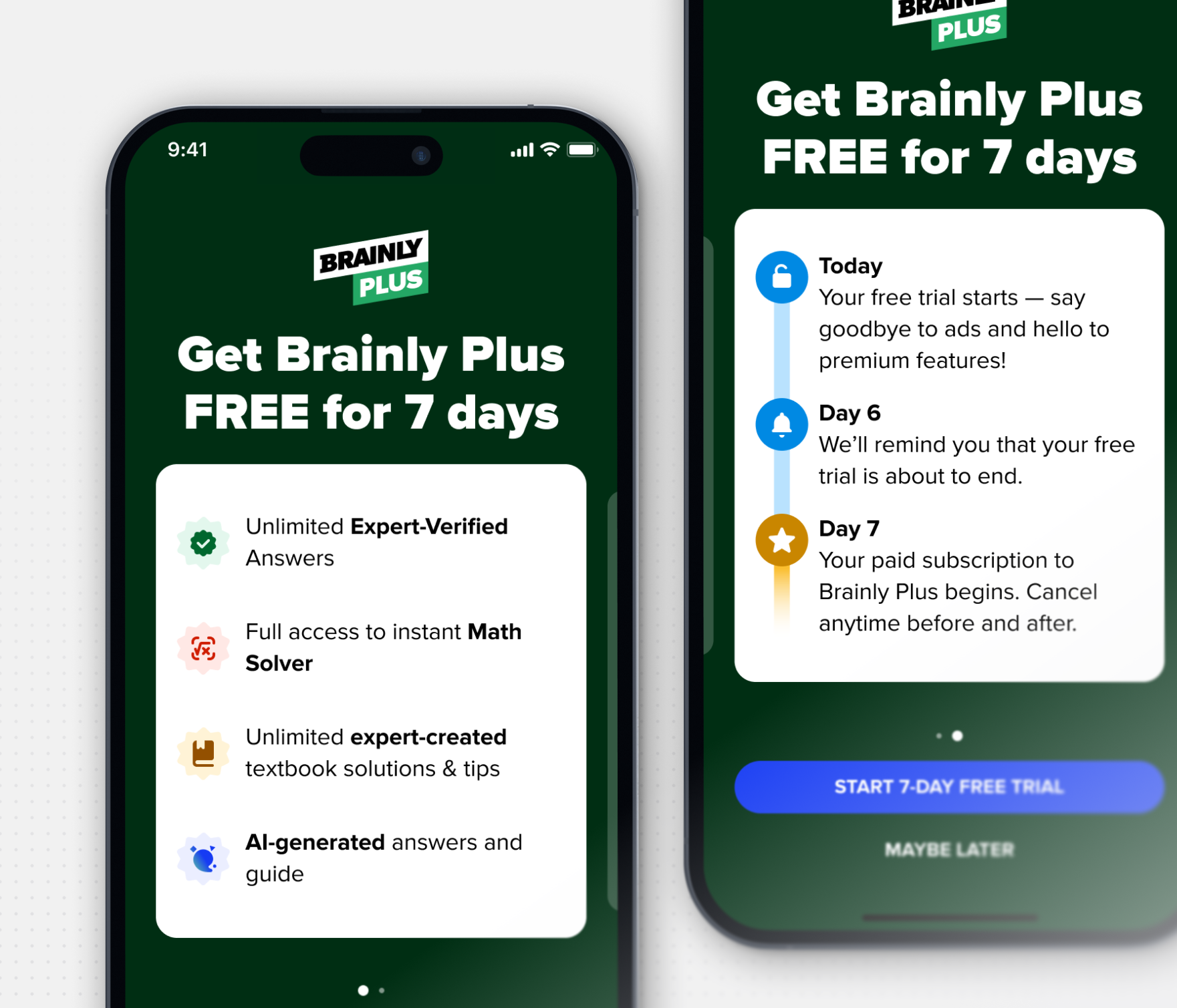
All upsell and promotional placements were reworked to position AI-powered features as a core premium benefit of Brainly.
See full project -> 
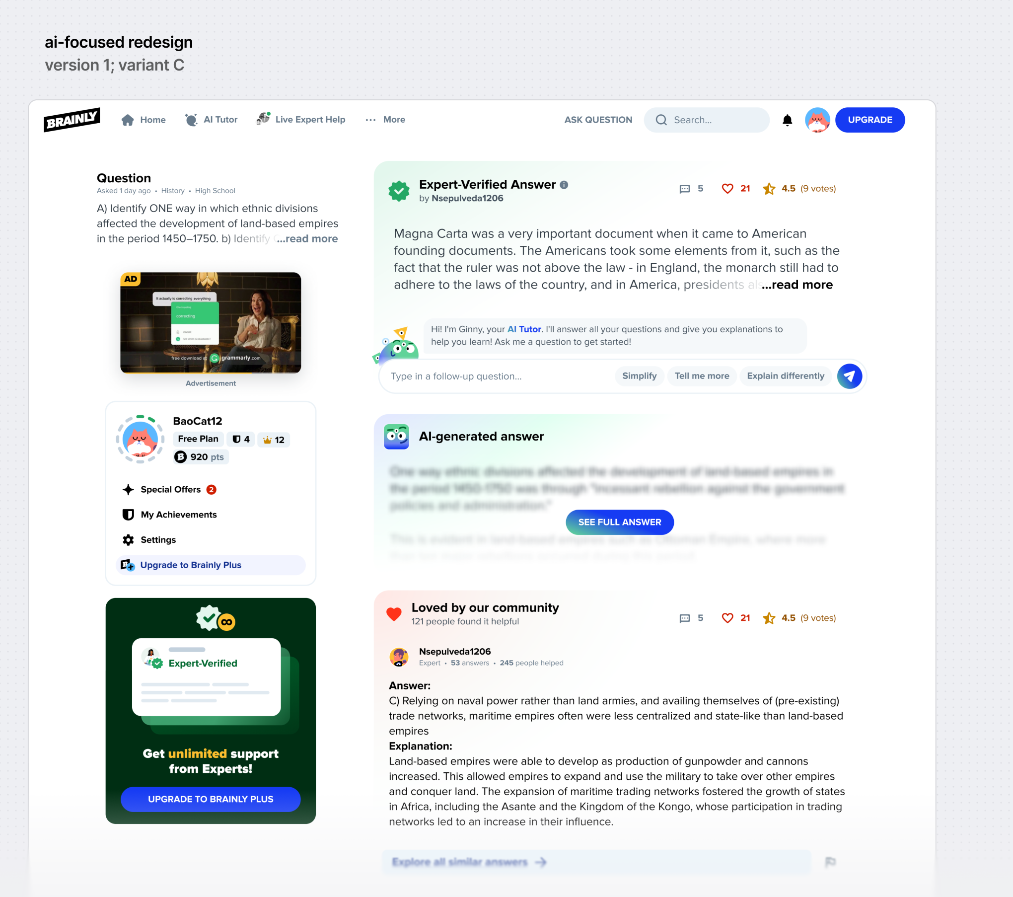
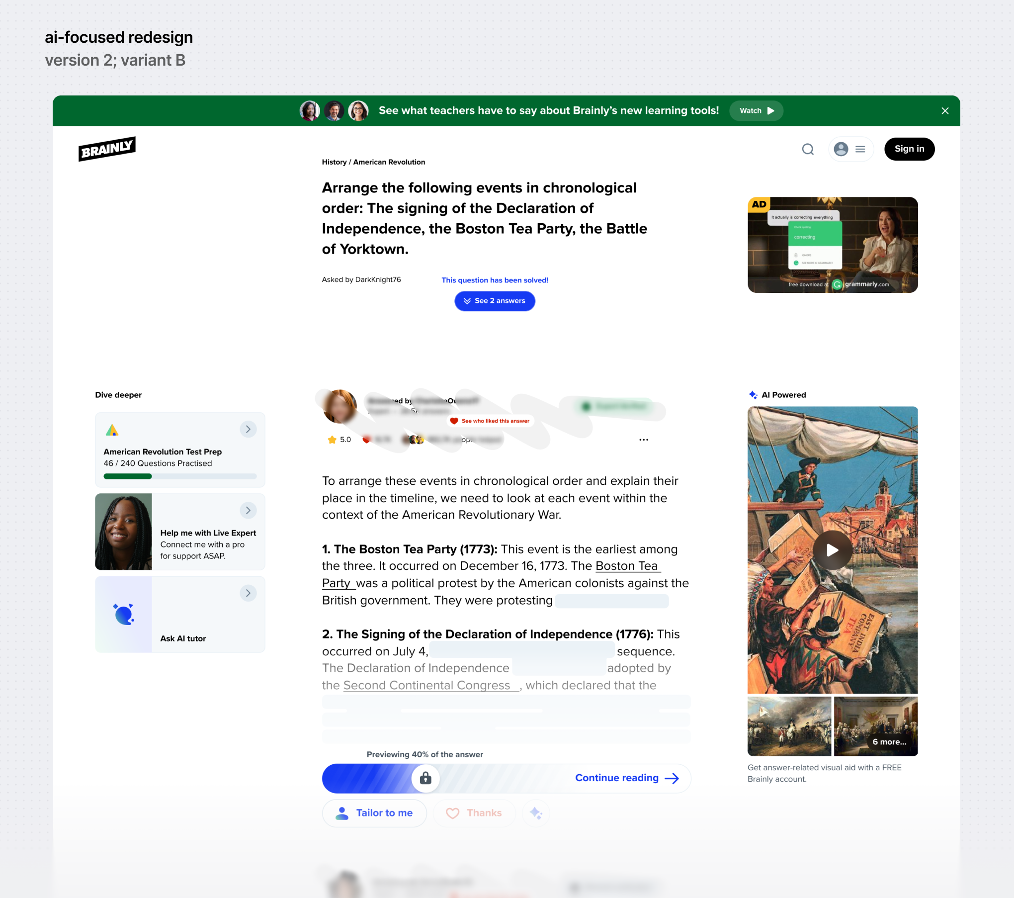
(1/3) Years of continuous experimentation had left the Question & Answer page, the most visited part of the product, cluttered and overloaded with content. I led the growth aspect of the redesign – I used insights gathered over time to create a cleaner, more focused UI that maintained monetization performance while integrating new AI-based features.
See full project -> 
(2/3) Growing popularity of ChatGPT and other gen-AI tools meant the Question & Answer page had to feature a more drastic redesign that trimmed all of the fat and put even more emphasis on AI-powered features than previously assumed.
See full project -> 
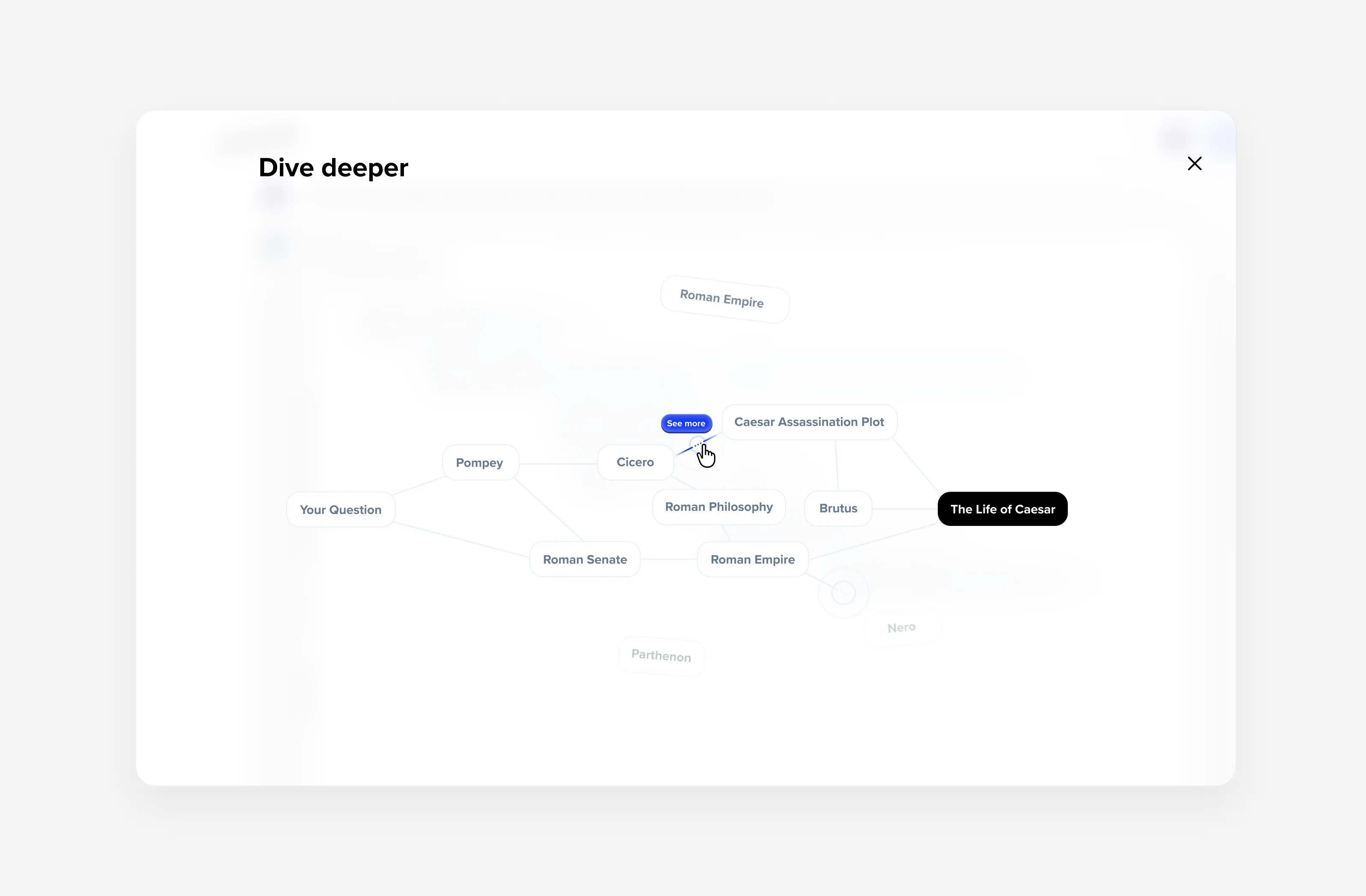
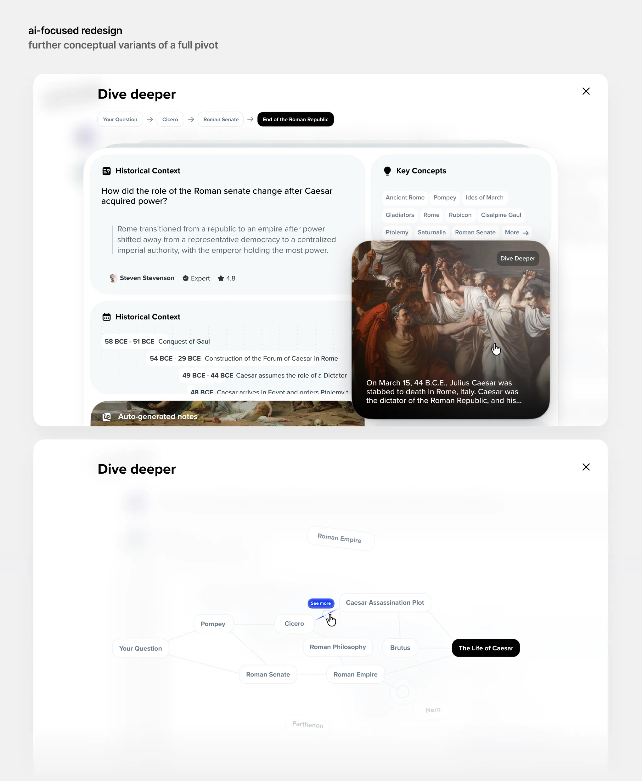
(3/3) Eventually, Brainly’s shift toward AI became a full-on pivot. AI wouldn't be just an integral part of Brainly's value proposition, but entirely replace existing core features. I led the exploration of this new direction, looking for new, interesting ways to push the envelope of ed-tech. This concept showcases "Dive Deeper"—an AI-powered feature that maps out and visualizes personalized learnings. (Fun fact: the game InfiniteCraft was a major inspiration for this!)
See full project -> 

that's not all/

…what was left out of this case study?

I keep the case studies relatively simple so they don't take a lot of time to go through (to varying degrees of success). This means this page only describes a tiny sliver of the work I did throughout my 4+ year tenure at Brainly (no, seriously, the documentation I have is tens of gigabytes large). In particular, the parts that were either omitted or barely touched on include:
‍
🏃 animations – there were many many more animations I did for Brainly, besides one shown here. It'd be impossible to show them all, given that your computer would probably explode if I tried to.
‍
🧩 design systems – I was very active in helping the design system team improve Brainly's design system Pencil. I worked on everything, from individual components to revamping the entire icon set from scratch.
‍
🚀 growth design – integrating AI into Brainly was inseparable from growth design. After all, what good can a feature be, if no one uses it? The entire initiative included a lot of iterative improvements and experiments. For more on this, check out the case study on Brainly Growth Experiments.

📏 ui design craft – this case study fails to capture the massive amounts of work done to deliver solutions that were also sound on a technical level. For a case study more focused on the "craft" part of my design experience, check out the Complete Redesign of NordPass.
‍
🤝 teamwork and stakeholder management – I touched on this a tiny little bit, but it's really difficult (and probably illegal?) to showcase this pretty critical part of the design process. The initiative was really high-stakes, and therefore I synced with stakeholders on the regular.

If you're interested in those, let's talk!

next project/

various product improvements/

NordPass is a password manager designed to make online security simple. My work there didn't have one specific product focus …it doesn't mean I just slacked off. It's the opposite, actually — I worked on everything: from improvements to the existing UX or small (but impactful) bug fixes, to major feature releases. A lot of this work is 'invisible', as NordPass is a technically complex cybersecurity solution where even the simplest of modals or alerts often require careful consideration.

years/

2024-25

responsibilities/

Leading a 0→1 design process of NordPass most significant feature releases. The process varied from project to project.

tags/
UI Design
Product Design
Illustration
Prototyping
User Research
Motion Design
Market Research
Interaction Design
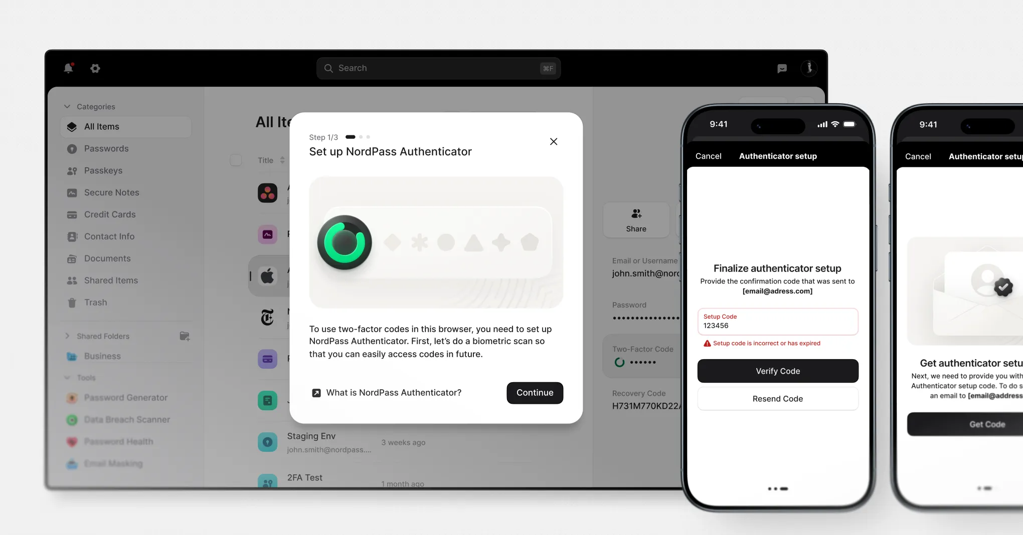
This particular project is a poster child of my Nord work. The process of setting up a temporary one-time password (TOTP) authenticator is pretty straightforward — it’s just three steps. But, A) I had to design this technically complex flow to be this simple, B) it’s not actually that simple. There are a multitude of error states, edge cases, or random scenarios I had to consider in the design process. Will most users ever see them? No. But they’re still crucial to include.
See full project -> 
Password managers are apps you don’t want to use, but have to use. In practice, users expect to find items as fast as possible, making Searching a critical feature. Most of the project was about complex technical planning of the Search’s logic following the “good UX is UX you don’t notice” mantra.
See full project -> 
See full project -> 
Navigation is a crucial part of NordPass, connecting its many different areas. To boost activation rates of the Security Tools, I redesigned them into a single, interactive menu that communicates their value at a glance.
See Full Case Study