…the mobile version of my portfolio is completely broken ■■


Massive project that spanned across native desktop apps, mobile apps, browser extensions. It wasn’t just about creating a cohesive UI, but driving alignment and collaboration across multiple teams to deliver a unified product vision.
years/
2024-25
responsibilities/
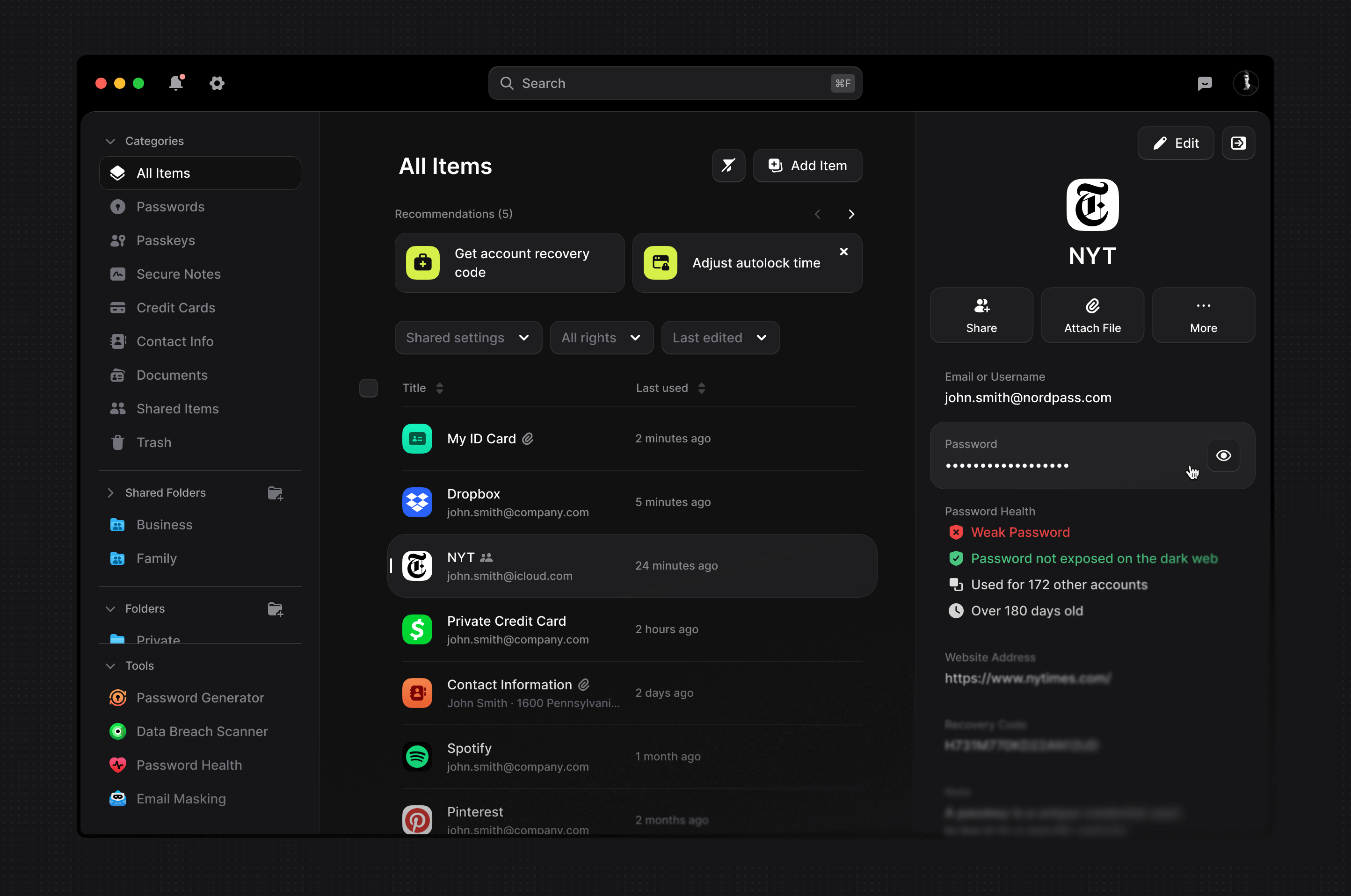
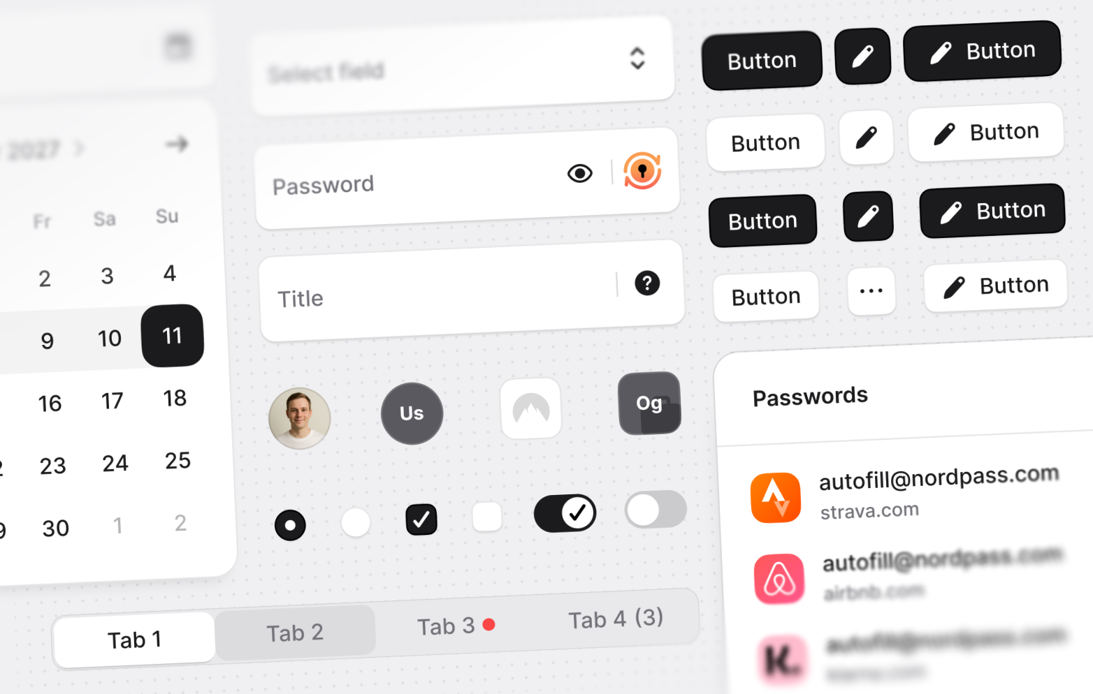
Led the full redesign of NordPass' desktop/web experiences. Helped reestablish the design system.
tags/

the problem/
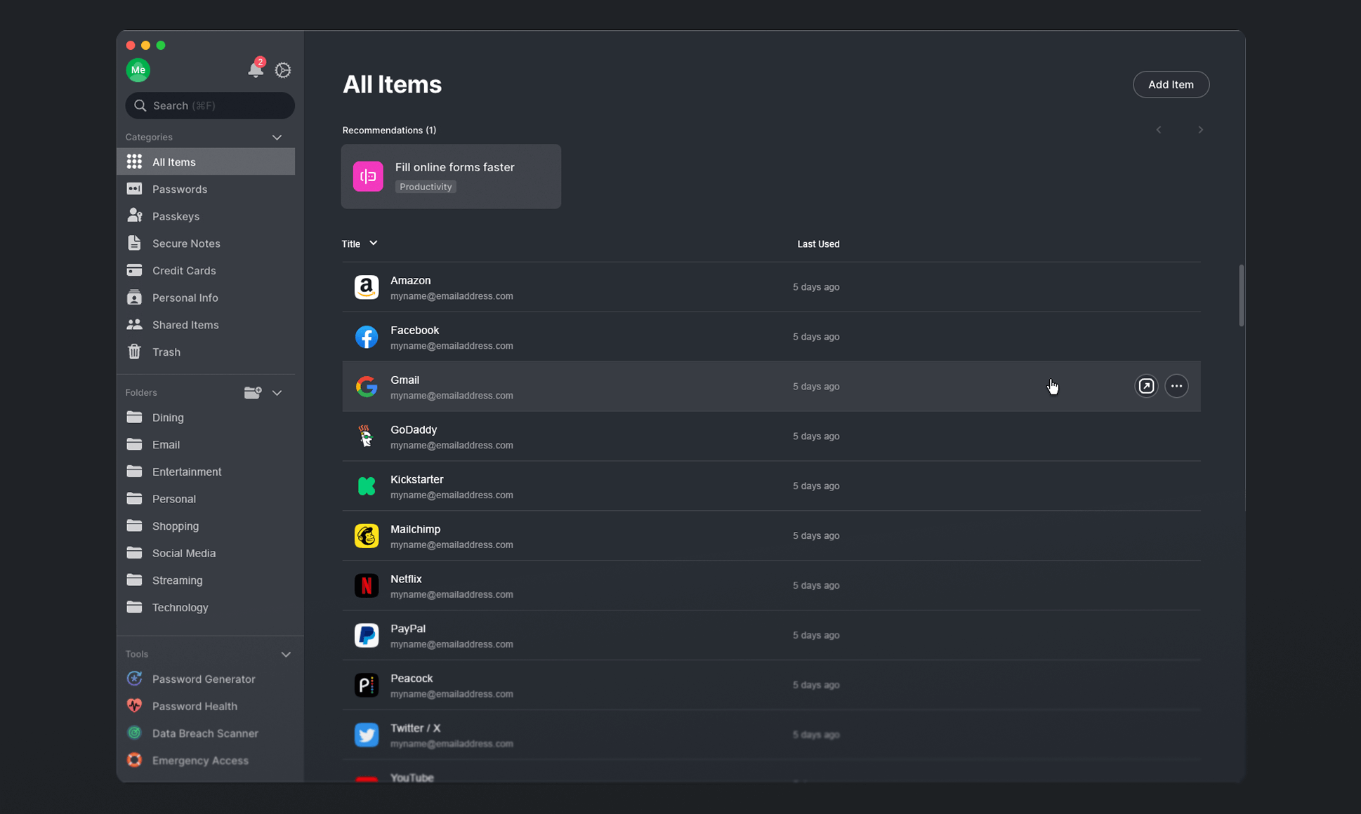
a disjointed and outdated UI
The product failed to meet users’ expectations in the visual department, and this lack of polish went beyond stylistic issues and resulted in a subpar and inconsistent UX. Beyond that, the outdated UI prevented many promising concepts from being implemented, and with a poorly enforced design system, designers and developers had to constantly realign even on the most basic elements.
the process/
a complete creative and technical refurbishment
A complete redesign is the dream of every product designer: to reimagine the entire product from the ground up. It sounds simpl- well no, it doesn't. And it wasn't. The process involved reestablishing the design system from scratch, creating a new modern visual language and design guidelines, and implementing them consistently across all platforms.
1
finding the creative direction/
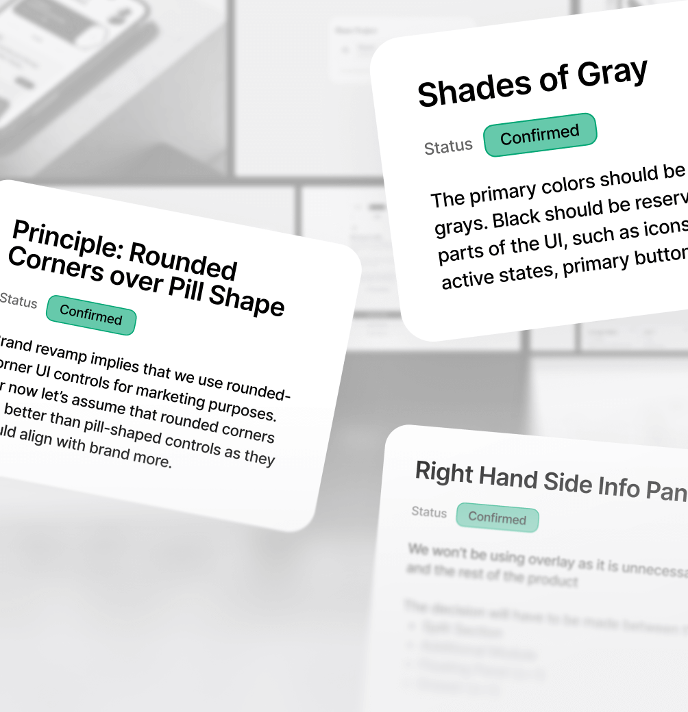
Product facelifts happen only every few years. As such, a signifcant part of the initiative was just finding a creative direction that wouldn't just be pretty, but also scalable and future-proof.
2
designing the scope/
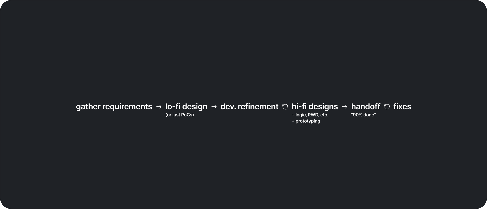
With the entire product needing a visual revamp across 4 platforms, the design process (I had to figure out) was often less about creativity, and more about optimally cutting corners without sacrificing quality.
3
fixing mistakes, step by step/
In design, mistakes are almost inevitable, especially in large-scale projects. User-testing confirmed this: while the redesign solved many existing issues, it also surfaced new ones, which I'd then iteratively address.
the results/
a brand new day, for both the UI and the 0→1 delivery process
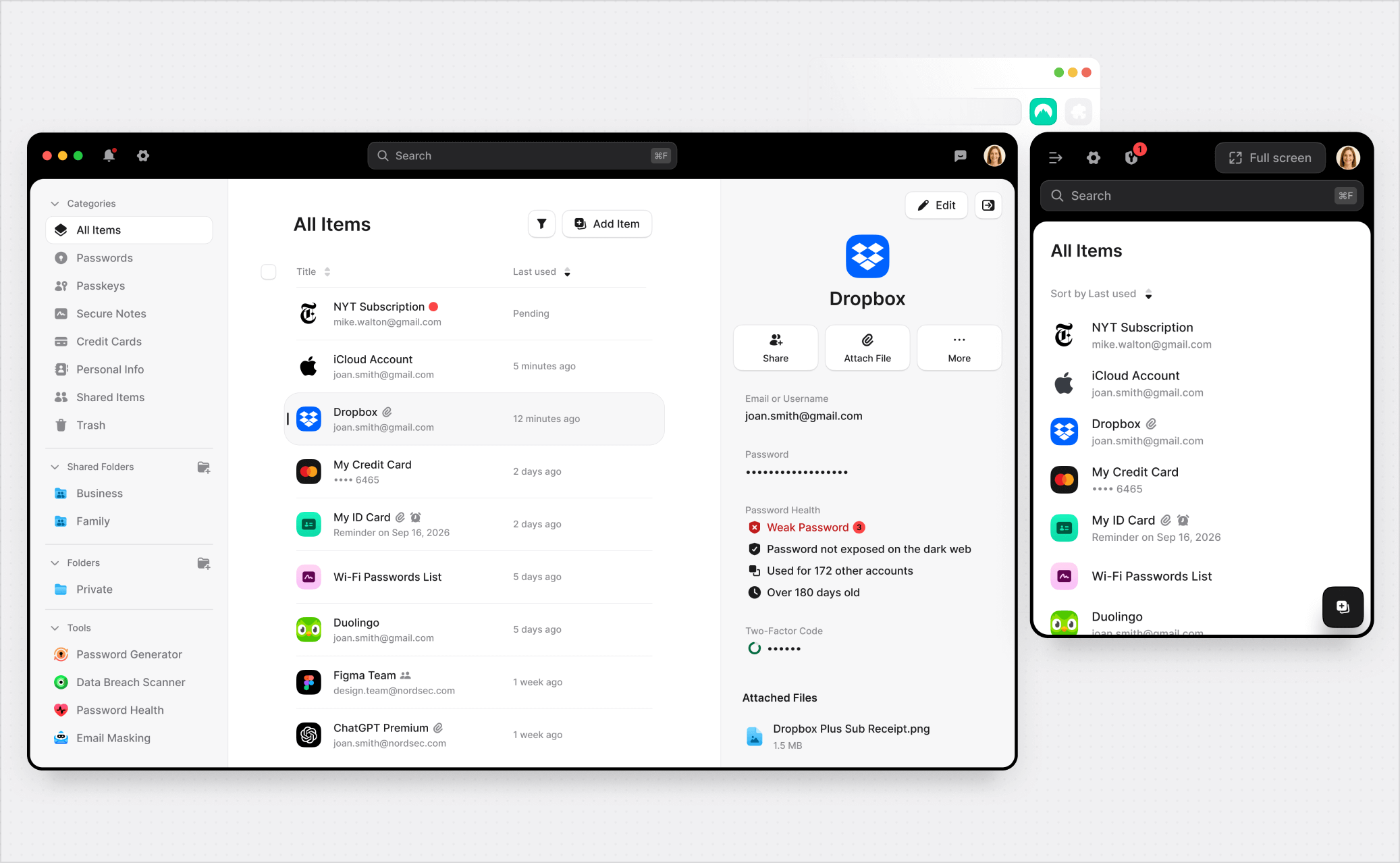
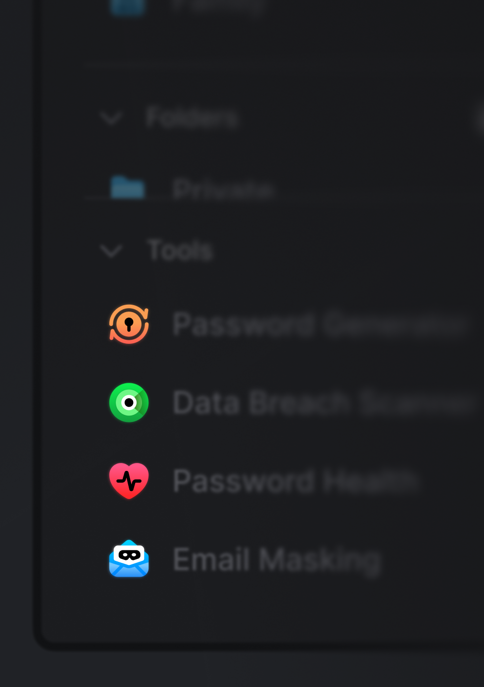
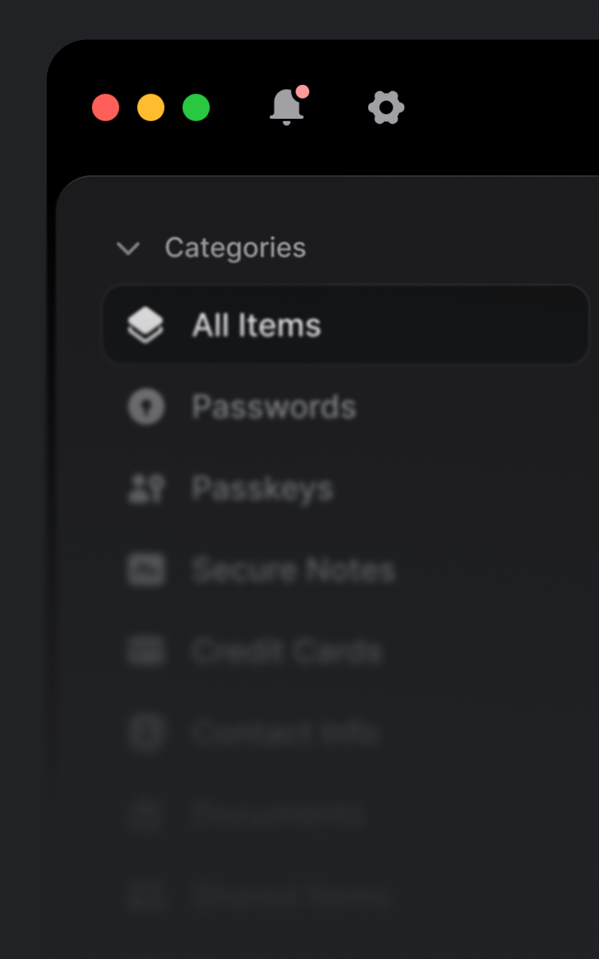
The new UI addressed major UX issues — from a confusing, unintuitive navigation to clearer, more consistent visuals and thoughtfully designed microinteractions. The redesign strengthened the design-to-development pipeline through a redone design system that unified designers and developers under the same language of tokens, components, and variables.
that's not all/
…what was left out of this case study?
I keep the case studies relatively simple so they don't take a lot of time to go through (to varying degrees of success). This means this page only describes a tiny sliver of the work I did on the project. In particular, the parts that were either omitted or barely touched on include:
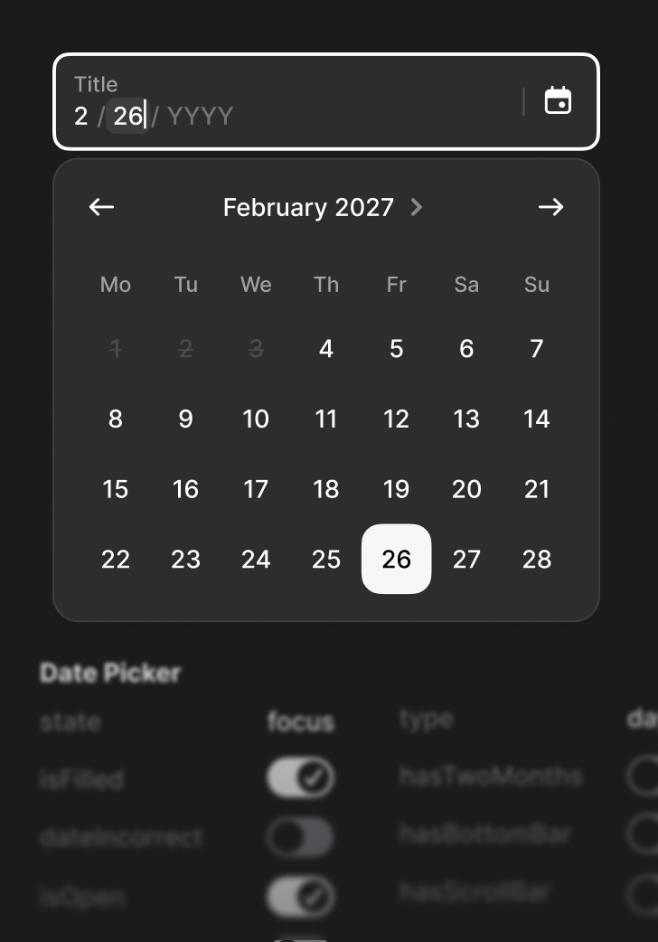
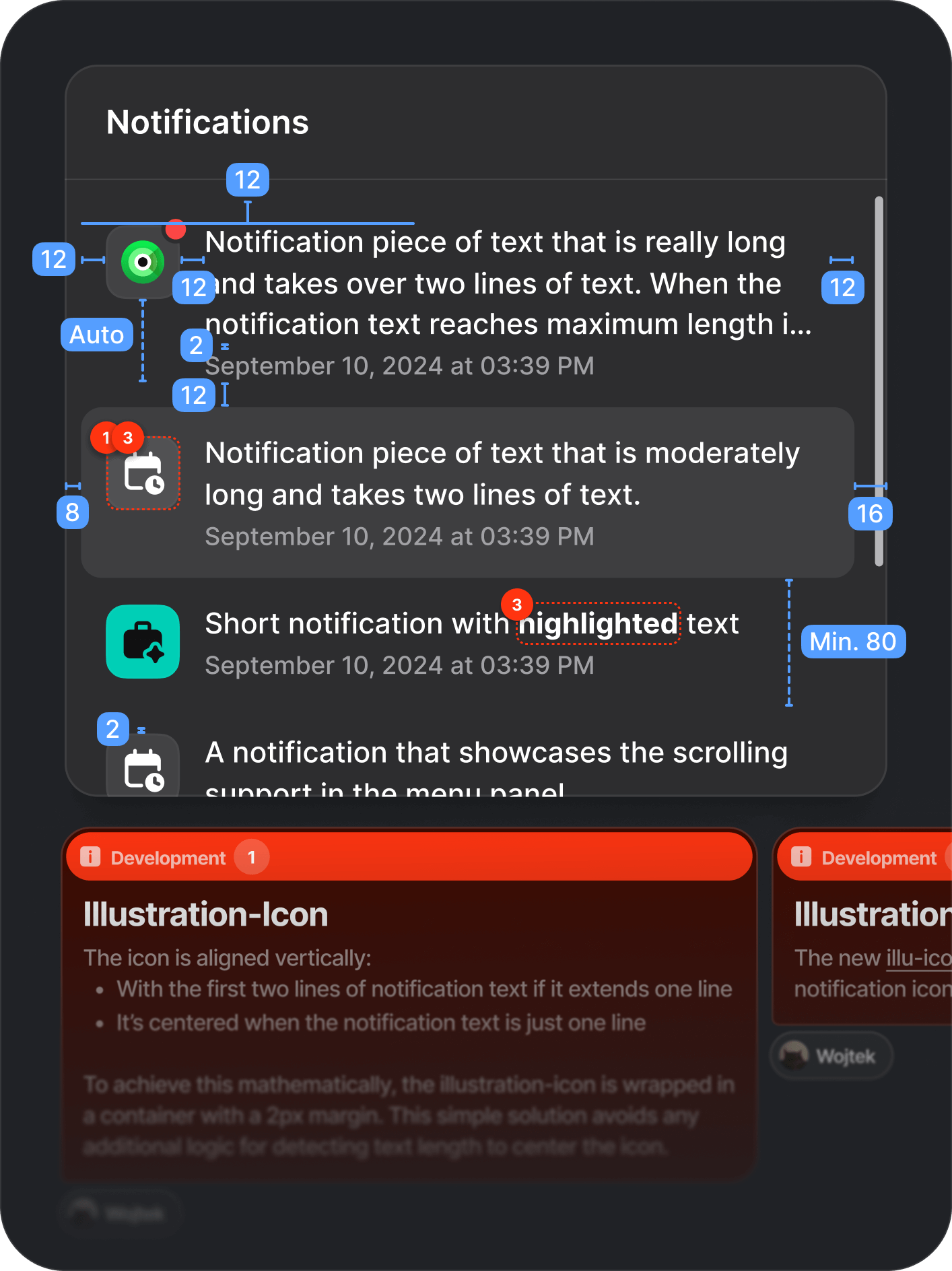
🔬 microinteractions – I've planned and designed several micro-interactions (i.e. entry animations, icons, loading states) to make the new redesigned UI come alive. This isn't just creative work, as all the timings needed to meet UX criteria and actually be implementable. Above, you can even see one of them done in code with AI tools.
🧪 user-testing – it's difficult to convey this in a case study, but speaking with users revealed many more issues with the design than mentioned on this page. Those would be iteratively addressed in subsequent version releases.
♟️ strategic planning – as the redesigning an entire product is a massive undertaking, the project required proper scoping and planning. I often had to reconsider priorities and plan ahead, moving certain UI updates to other projects to free up dev capacity.
🤝 teamwork and stakeholder management – an unsung, but incredibly important, part of any design project. Most of my ideas weren't just welcomed with open hands (unbelievable, right?) I often had to defend, pitch, iterate, or scrap them.
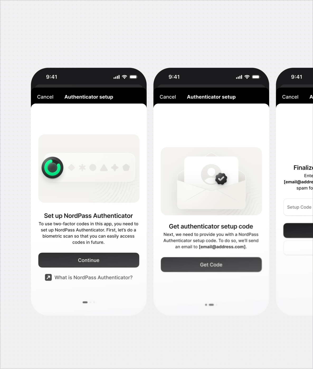
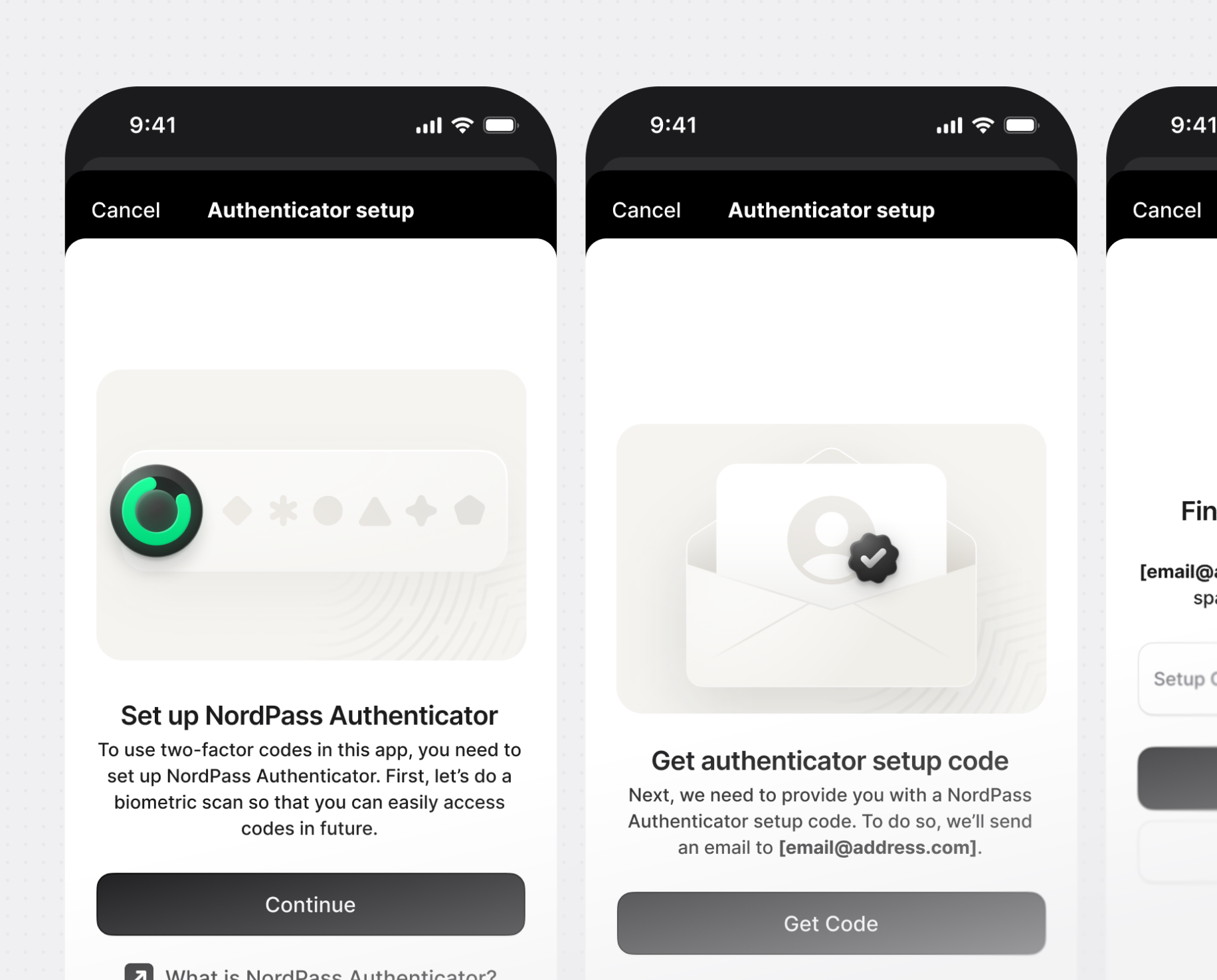
📱 cross-platform consistency – while my focus was on the desktop/web/browser extension experiences, I still had a hand in redesigning the mobile apps. Parts I didn't directly design, I had to ensure were consistent across the board.
If you're interested in those, let's talk!
microinteractions
I've planned and designed several micro-interactions (i.e. entry animations, icons, loading states) to make the new redesigned UI come alive. This isn't just creative work, as all the timings needed to meet UX criteria and actually be implementable. Above, you can even see one of them done in code with AI tools.
microinteractions
It's difficult to convey this in a case study, but speaking with users revealed many more issues with the design than mentioned on this page. Those would be iteratively addressed in subsequent version releases.
microinteractions
as redesigning an entire product is a massive undertaking, the project required proper scoping and planning. I often had to reconsider priorities and plan ahead, moving certain UI updates to other projects to free up dev capacity.
microinteractions
an unsung, but incredibly important, part of any design project. Most of my ideas weren't just welcomed with open hands (unbelievable, right?) I often had to defend, pitch, iterate, or scrap them.
microinteractions
while my focus was on the desktop/web/browser extension experiences, I still had a hand in redesigning the mobile apps. Parts I didn't directly design, I had to ensure were consistent across the board.

next project/

A summary of many different initiatives I led over my 4+ years at Brainly, an edtech market leader. Each focused on one shared goal – driving growth – which required not only strong design and strategic thinking but also skills in many disciplines such as product management, data analysis, or user research.
years/
2020-24
responsibilities/
Led several initiatives focused on growth and monetization of the product, both from the design and management sides.
tags/